Logos
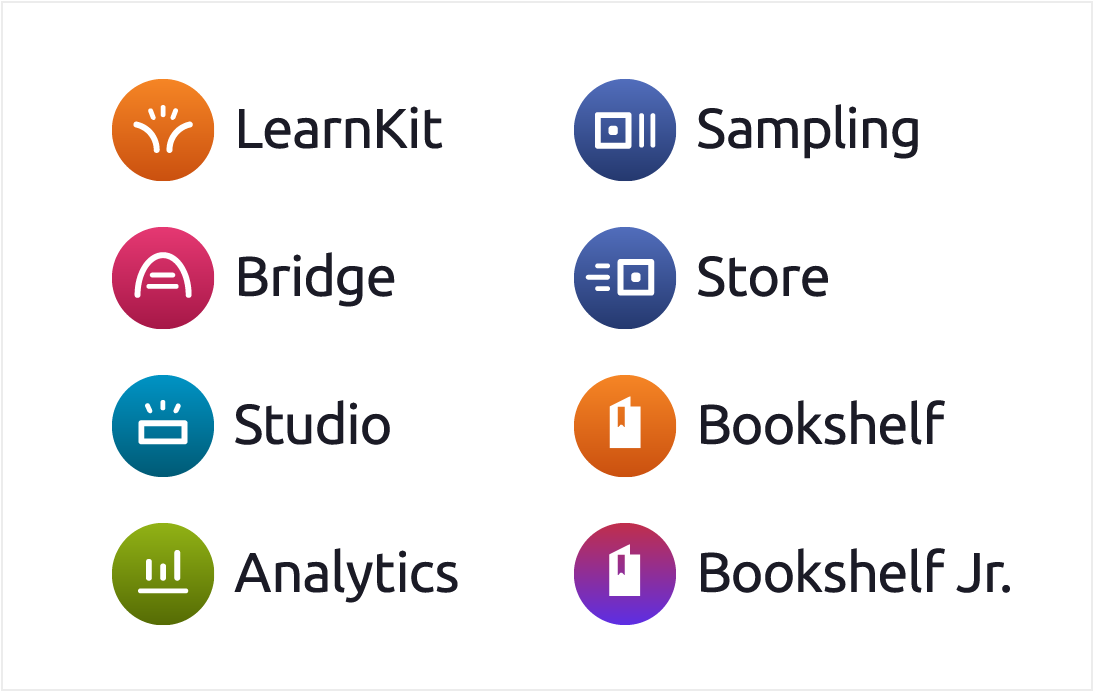
Circle Logos
- Marketing - Please ONLY use these logos
- circles can be stacked or horizontal with logo name, or appear on their own

Circle Stacked (Black Text)
Circle Stacked (White Text)
Circle Stacked (All White)
Circle Horizontal (Black Text)
Circle Horizontal (White Text)
Circle Horizontal (All White)
Favicons
Horizontal Logos
- for product use ONLY
- do not use in marketing materials
Horizontal Logos (White)
Old VST Product Name Templates
Colors

Cheddar
1
#fef3e9
19.21
2
#fec491
13.52
3
#fead64
11.38
4
#f58525
8.26
5
#e06107
5.88
6
#ca500f
4.50
7
#b0430c
5.75
8
#983600
7.34
9
#772700
10.12
10
#571d00
13.28
Ocean
1
#eaf7fc
19.21
2
#b0e3f4
15.14
3
#75cfec
11.89
4
#00a7db
7.55
5
#0093c4
6.97
6
#007fad
4.53
7
#006c94
5.88
8
#005a75
7.72
9
#00465c
10.34
10
#003342
13.53
Magic
1
#f2f4f9
19.08
2
#D2D9ED
14.89
3
#B2BEE0
11.33
4
#91A3D4
8.39
5
#7188C7
6.05
6
#5773BF
4.56
7
#425BA1
6.48
8
#334A88
8.48
9
#24386E
11.25
10
#002244
16.00
Sangria
1
#FDF2F5
19.20
2
#FBCADA
14.56
3
#F8A2BF
10.91
4
#F57AA3
8.20
5
#ED3E79
5.57
6
#D81E5D
4.93
7
#BF1B52
6.01
8
#A61747
7.41
9
#8C143C
9.21
10
#610E29
13.10
Jungle
1
#E8F7F2
19.02
2
#C0EADB
16.03
3
#86E0C2
13.45
4
#24C991
9.84
5
#1A9C6E
6.02
6
#16825C
4.79
7
#12694A
6.68
8
#0D4F38
9.58
9
#0A3C2B
12.40
10
#07291D
15.63
Pickle
1
#F4F6EA
19.22
2
#E0EAB8
16.63
3
#CCDE87
14.37
4
#A3C523
10.57
5
#7E9E06
6.78
6
#637d05
4.70
7
#536904
6.19
8
#415203
8.63
9
#303D02
11.71
10
#202902
15.22
Brick
1
#FEF3F1
19.30
2
#FAC3BB
13.59
3
#FAA094
10.52
4
#FA7D6D
8.22
5
#EB4F3B
5.71
6
#D24634
4.50
7
#B83E2E
5.58
8
#9E3528
7.01
9
#7A291F
9.70
10
#571D16
13.19
Mist
1
#EBF9FC
19.49
2
#C9E5EA
15.88
3
#ACD5DD
13.31
4
#6EADBA
8.35
5
#5F96A1
6.36
6
#4F7E87
4.50
7
#41666E
6.27
8
#324E54
8.92
9
#273E42
11.33
10
#1D2D30
14.28
Eggplant
1
#F8F5FA
19.43
2
#DDCBE9
13.79
3
#C4A4D9
9.66
4
#B389D0
7.41
5
#A775C9
6.03
6
#945EB9
4.60
7
#794D96
6.33
8
#5E3C75
8.83
9
#3F284F
12.90
10
#2D1C38
15.73
Neutral Palette
Cloud-10 should be used as your default text. Ninja is used only for global nav and hamburger menu items.
Cloud
1
#fafafa
20.12
2
#f6f6f6
19.43
3
#ececec
17.78
4
#dadada
15.02
5
#949494
6.92
6
#757575
4.61
7
#646464
5.92
8
#525252
7.81
9
#3c3c3c
11.03
10
#1c1c1c
17.04
Frost
1
#f6f8fc
19.75
2
#edf0f5
18.38
3
#dfe4eb
16.43
4
#ced2d9
13.84
5
#888c94
6.23
6
#71747a
4.69
7
#5b5e63
6.51
8
#46494d
9.05
9
#343538
12.26
10
#1c1d1f
16.87
Ninja
9
#40404c
10.22
10
#2f2f39
13.24
11
#1b1b26
17.05
Validation Colors
Only used for success or error messaging. Do not use as part of overall color scheme.
Red
1
#FFF2F4
19.26
2
#FFE1E6
17.16
3
#FABCC5
13.06
4
#F78394
8.63
5
#ED596F
6.26
6
#E71D3A
4.53
7
#D21C35
5.31
8
#A9172C
7.38
9
#7E1021
10.59
10
#5c0c18
13.81
Green
1
#Edf7ed
19.13
2
#d1ead1
16.40
3
#a3d4a3
12.50
4
#79c679
10.17
5
#35a335
6.44
6
#048a04
4.52
7
#047103
6.23
8
#015e02
8.07
9
#024d03
10.17
10
#023302
14.22
Typography
Used for all text (headers, body, buttons).
300 Light
400 Regular
500 Medium
700 Bold
900 Black
 Google Fonts
Containers & Cards
Basic Styling
- background color can vary, but white is preferred
- 4px rounded corners
- do not use a stroke and drop shadow on one object
Containers
- box-shadow: 0, 1px, 3px, 0, rgba(0, 0, 0, 0.2)
- holds large sections of information on a page
- works best on cloud-2
Cards
Flat
- no drop shadow
- border is cloud-3
- can be used in white container or on cloud-2
Raised
- box-shadow: 0, 1px, 3px, 0, rgba(0, 0, 0, 0.2)
- no border
- can be used in a container or on its own
- hover box-shadow: 0, 4px, 15px, 0, rgba(0, 0, 0, 0.2)
Flipping animation
- perspective: 2000px
- card flips around center
- transition: all .4s ease-out
Click to flip
Click to flip back
Card Content
Images
- images/graphics can extend to edges of card, or fall within a padded area
Card with Full Bleed Image
Card with Centered Image
Text
- keep text to a minimum
This is the title of this card
Followed by a sentence that gives more info.
Badges and Tools
- bottom of card can be utilized for badges and tools
- bar can be used across bottom to visually separate tools from rest of card
- use the ellipsis icon for more options
- ellipsis can trigger a menu or flip card
- top right corner of card can be marked
Chips
Chips without X
- text is Roboto Regular 14px cloud-10
- suggested height 32px
- suggested background is a neutral or a light shade of your primary or secondary color (make sure text is accessible)
- border is 1px solid and one shade darker than background
- hover changes background one shade darker, border remains the same
Chips with X
- same specs as above
- x is cloud-10

Dialogs
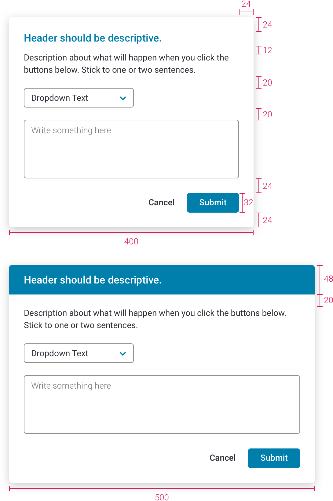
General
Rules
- header and buttons alone should be able to describe the purpose of the dialog
- height depends on amount of content / if content is so long you’re forced to scroll, consider whether a dialog is the right solution
Specs
- suggested widths: 300px for short messages, 400px or 500px for more complex content
- titles should be left aligned (they can be centered in special cases)
- background overlay is 50% black
- header is 17px Medium, line height 1.35
- description is 14px Regular cloud-10, line height 1.43
- 4px rounded corners
- box-shadow: 0, 4px, 15px, rgba(0, 0, 0, 0.2)
Alerts
Purpose
- forces user to confirm action before proceeding
Rules
- requires user interaction to continue (clicking cancel or continue)
- no x
- cannot click outside of dialog to close window
- text in button alone should tell user what will happen
Specs
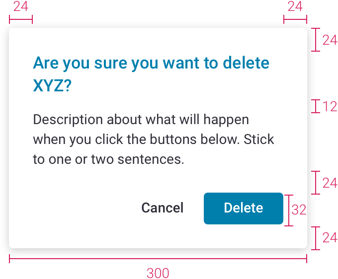
- 300px max width
- header is primary color
- try to keep header on 1 or 2 lines
- bar behind header is primary color
Example
- "Are you sure you want to delete..." message
Dialogs with User Input
Purpose
- holds information input by user that shouldn’t be easily dismissed
Rules
- requires user interaction to continue (clicking cancel or continue)
- no x
- cannot click outside of dialog to close window
Specs
- same as above (but keep header to 1 line)
- bar behind header is primary color
Example
- feedback form
Basic Dialogs
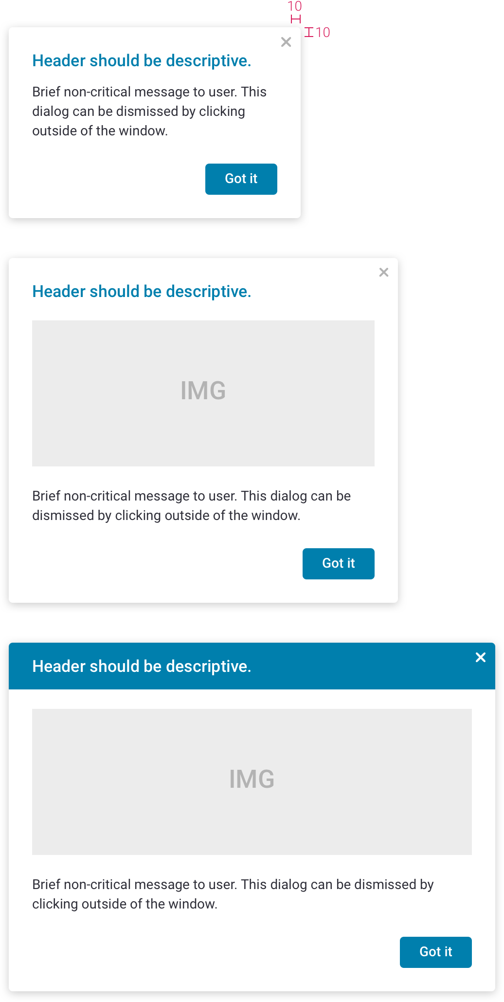
Purpose
- relays non-critical message to user
Rules
- user can click outside to close window
- has an x
- no cancel button since x and clicking outside of window both close window
Specs
- same as above
Examples
- coaching tip
- onboarding slideshow
Mobile
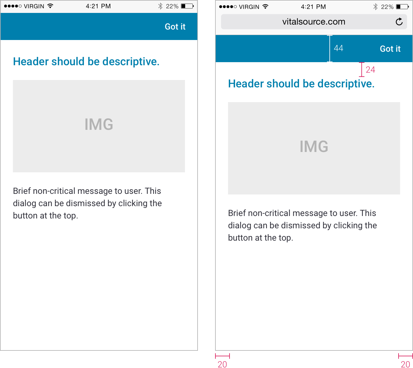
- all popups should be full screen on mobile (except alerts and special cases)
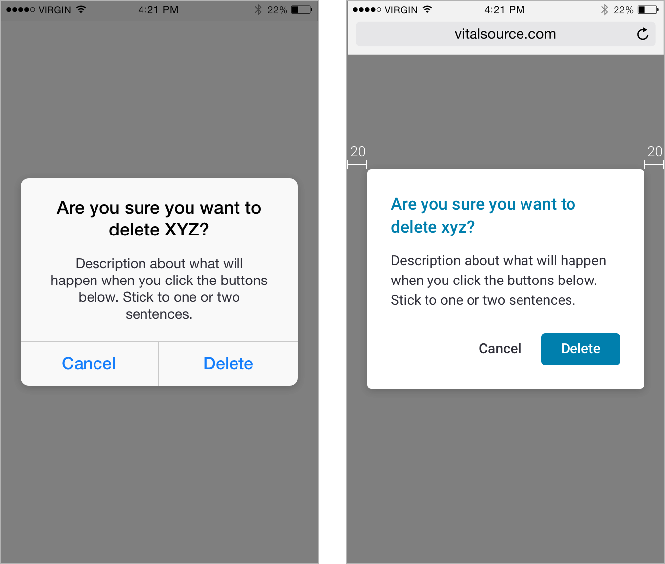
Alerts (mobile)
Rules
- mobile apps: use system popups
- mobile browser: same style popup as large screens (see specs)
Specs
- 300px max width
- 20px margins
Dialog with User Input (mobile)
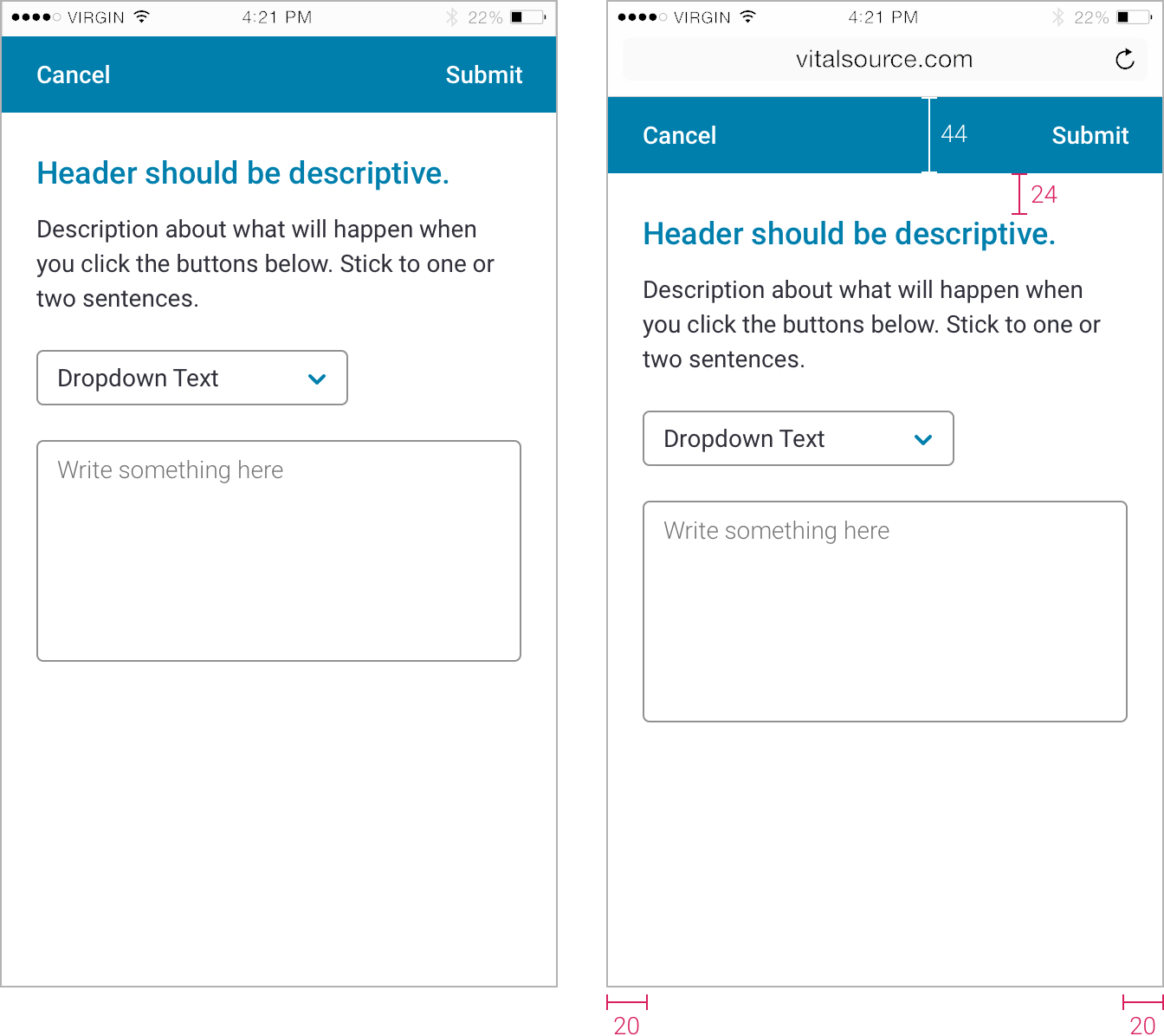
Rules
- full screen
- 2 buttons are positioned in bar at top
Specs
- all specs not specified are same as large screens (see specs)
Basic Dialogs (mobile)
Rules
- full screen
- 1 button is positioned in bar at top
Specs
- all specs not specified are same as large screens (see specs)
Forms
General
- on hover/focus, all inputs should use transition: all .15s cubic-bezier(0.6,0.0,0.4,1)
- all text has line-height: 1.5
- best practice is to include a label with every input
- labels and placeholders are title case (unless they are written as a sentence)
- use error messages instead of a disabled submit button (especially on long forms)
Colors
- cloud-10: labels, focus field border
- 57% black: placeholder text, disabled labels, disabled input text, disabled add-on text
- 43% black: default field border
- 20% black: disabled field border
- cherry-2 for error border and error text
- cherry-3 for error border focused state
Cloud-10
#1C1C1C
57% black
43% black
20% black
Cherry 1
#f54250
Cherry 2
#cc313d
Cherry 3
#510006
Text Fields
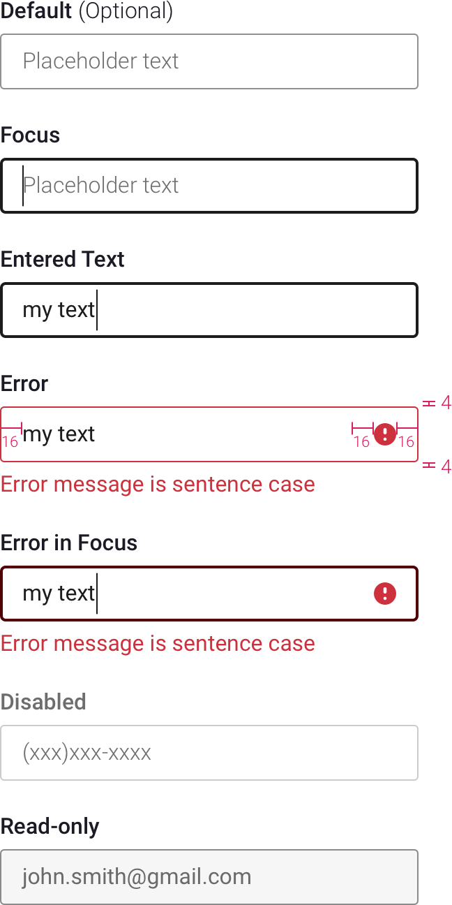
Default
- border is 1px solid 43% black
Focus
- placeholder text is visible until you start typing
- border is 2px solid cloud-10
Entered Text
- Regular cloud-10
Error State
- border is cherry-2
- error message appears when you click submit, or when the text field loses focus
- error message is sentence case
- error message is Regular cherry-2
Error in Focus
- border is 2px solid cherry-3
Disabled
- border is 20% black
- input text, label are 57% black
Read-only
- border is 43% black
- background is cloud-2
- input text is 57% black
Text Fields with Buttons and Add-ons
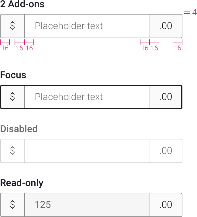
With Add-on
- add-on can be on either or both sides of text field
- add-on text is Regular, cloud-10, same size as input
- add-on padding is same as padding within input
- add-on background is cloud-1
Focus
- same specs as text fields section above
Disabled
- same specs as text fields section above
- add-on background is white
- add-on text is 57% black
Read-only
- same specs as text fields section above
- add-ons don't change from default
Selects
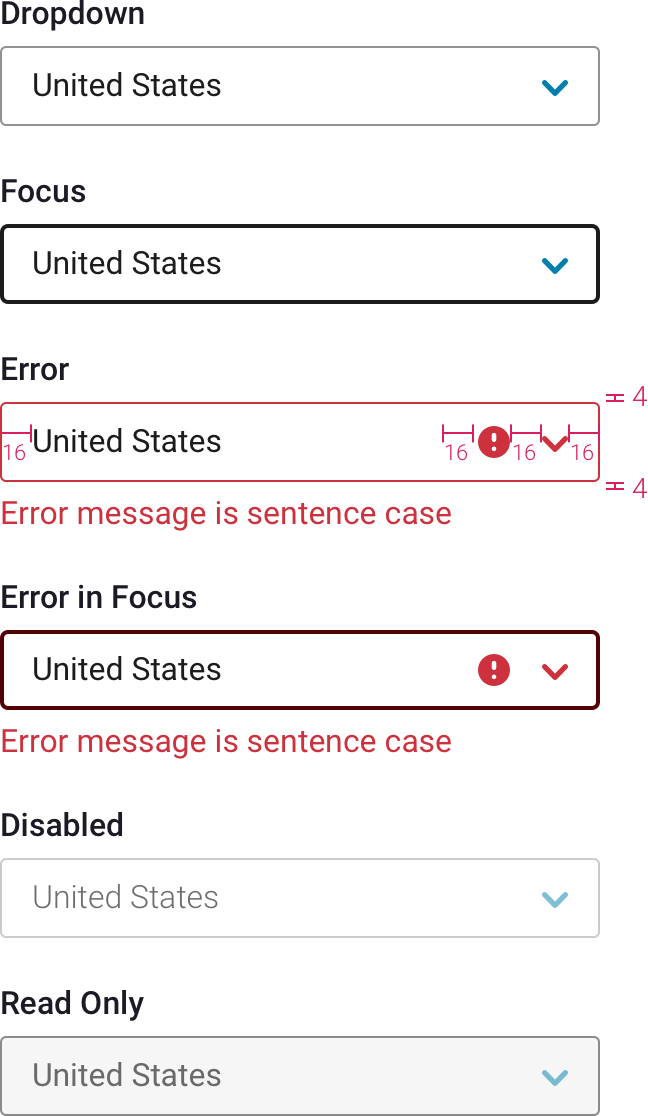
Default
- everything above applies to selects
- arrow is caret-down-sm in primary or accent color
- use browser’s default menu style
Error
- border, icon, and caret are cherry-2
Error in Focus
- border is 2px solid cherry-3
Disabled
- same specs as text fields section above
- caret is 50% opacity
Read-only
- same specs as text fields section above
- caret is 50% opacity
Checkboxes
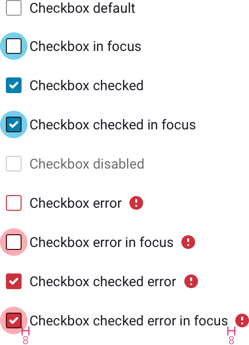
Default
- Roboto Light, same size as input text of adjacent fields
Focus
- checkbox gets focus when tabbing to it
- background circle is shade #3
- border is 1px solid cloud-10
Checked Focus
- background circle is shade #3
- border is 1px solid cloud-10
Disabled
- border is 20% black
- text is 57% black
Error
- icon is cherry-2
- icon is positioned 8px from text
- if checkbox is within a box, align error icon horizontally with error icon in fields above/below
Error Focus
- background circle is 43% cherry-1
- border is 1px solid cherry-3
Checked Error Focus
- background circle is 28px, color is 43% cherry-1
- border is 1px solid cherry-3
Radio Buttons
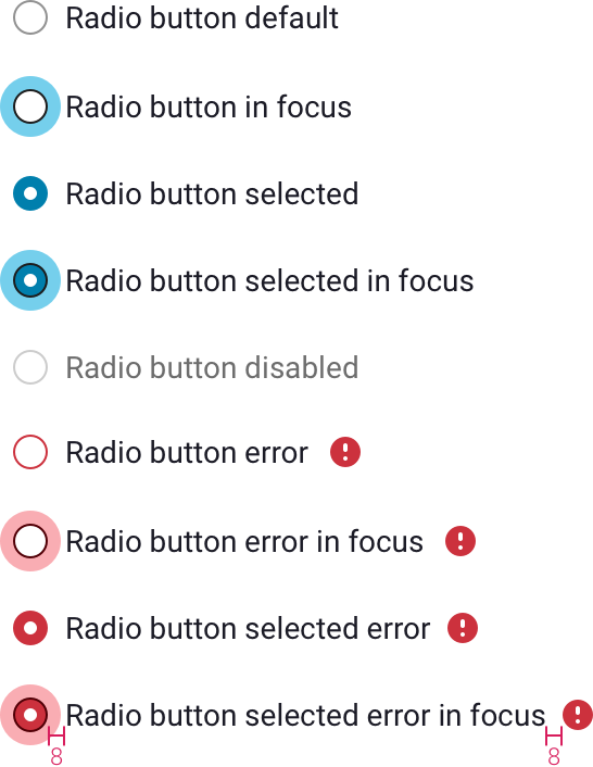
- same specs as checkbox section above
Sizes
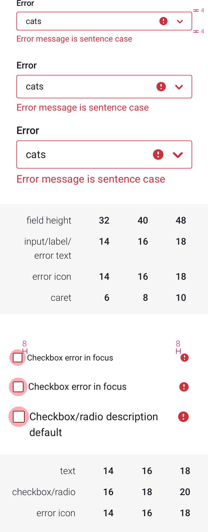
- fields can be 32, 40, or 48px tall
- match checkbox/radio button text to field text size
- 40px is the default
- text and icon sizes grow as field gets taller (padding remains the same)
Icons

Basic Icon Set
Global Nav Icon Set
Hamburger Menu Icon Set
Creating Basic Icons
- 20 x 20 grid
- most icons should fall within 18 x 18 area
- small details can fall in the 20 x 20 area
- use 2px width for thin lines
- use 45 degrees for angled icons
- 2px rounded corners
- avoid designing on half pixels wherever possible
- try to stick to one color for icons
Creating Global Nav Icons
- 28 x 28 grid
- most icons should fall within 24 x 24 area
- small details can fall in the 28 x 28 area
- use 2px width for thin lines
- use 45 degrees for angled icons
- 2px rounded corners
- avoid designing on half pixels wherever possible
Search Fields
Rules
- explain to users what they can search for with placeholder (ex: “Search my library”)
- enter key submits search (even when a button is present)
- search term remains in field after submitting search
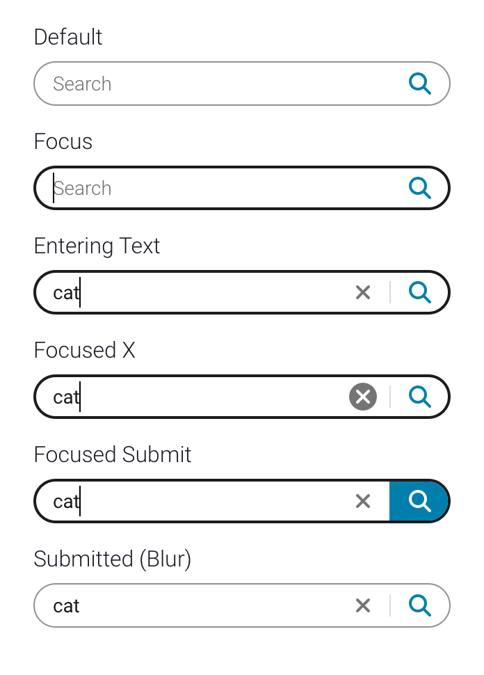
- x appears as you start typing
- after clicking x, x disappears and field is in focus
- x clears search term
- x can clear search results as well (depending on the context)
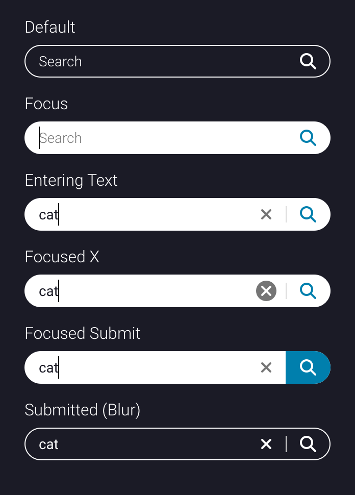
Search Field with Submit Button
- on focus, submit button background turns color that icon originally was, and icon turns white
- use button or enter key to submit search
Light Background
- x button is cloud-6
- on focus, x button background is cloud-6, and icon is white
- field border color/thickness, placeholder text, entered text, all follow same specs as a generic field
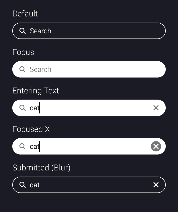
Dark Background
- dark background can be the global bar, or any color #6 or higher
- default border is 1px solid white
- focused field has solid white background and no border
- placeholder, input text, search icon, x, and divider line are all white when field is blurred
Rectangular Search Field
- if the rounded field doesn’t fit with your design (ex: your search field sits next to a rectangular select), you can opt to use a rectangular field
- these fields have same border radius as a generic field
- functionality and all other styles match that of the rounded search field

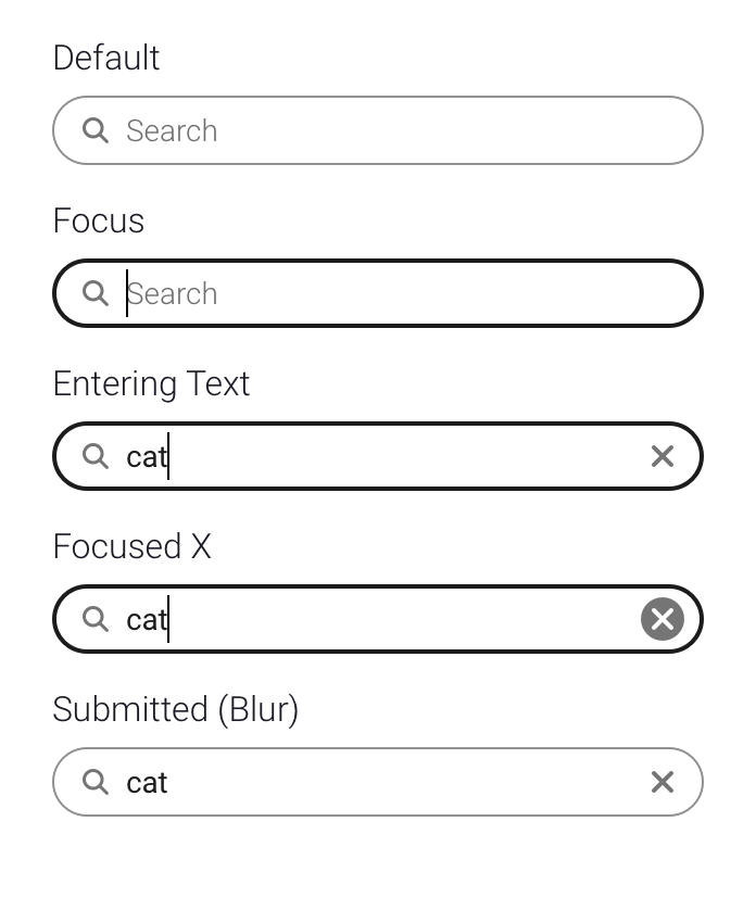
Incremental Search
- search results update as you type
- search icon is NOT a submit button
Sizes
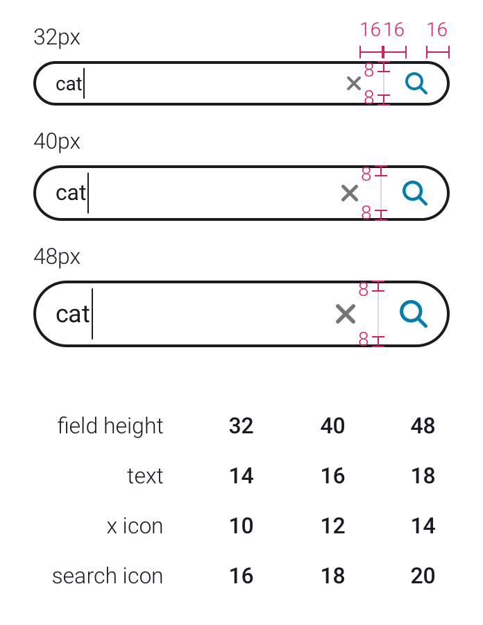
- search fields can be 32, 40, or 48px tall
- 40px is the default
- text and icon sizes grow as field gets taller (padding remains the same)
Search Typeahead
Rules
- typeaheads contain search predictions and/or search hits
- search predictions bring you to a search results page
- search hits bring you directly to that result (ex: opens a book)
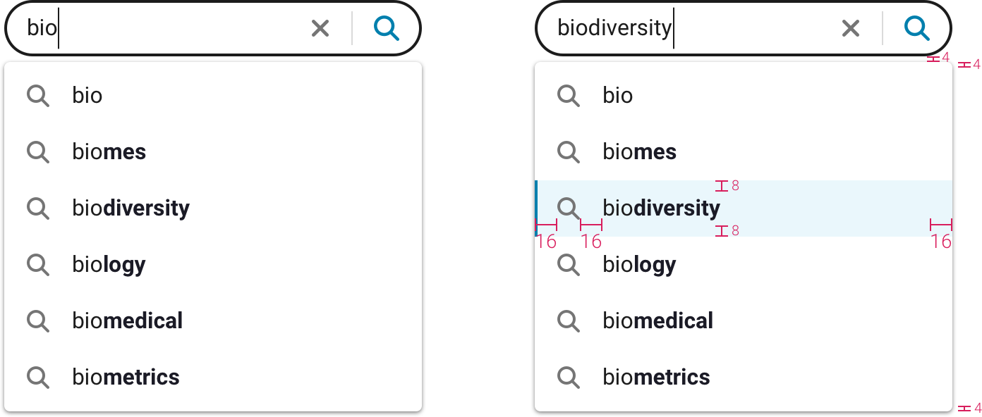
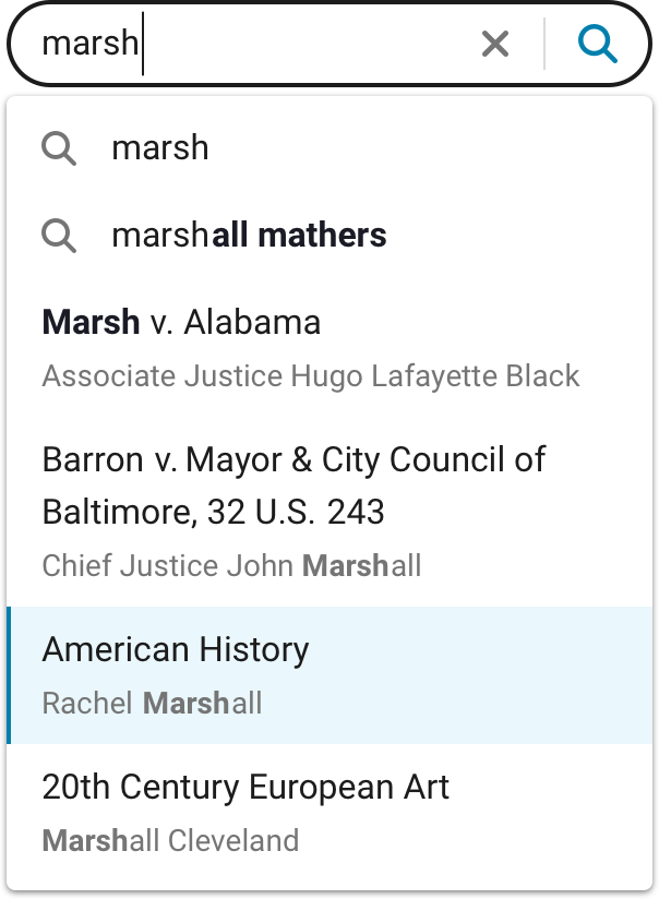
- first item in list must be magnifying glass icon with your search query (clicking this is the same as clicking the submit button in the search field)
- search results must be visible in typeahead menu (ex: author names)
- search query is bold in a direct hit
- predicted text is bold in a search prediction
Specs
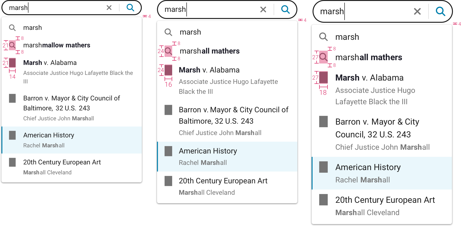
- menu can be small, medium or large (text sizes 14px, 16px, 18px)
- default is medium
- size of typeahead menu is not tied to size of search field (small search field can be paired with medium typeahead menu)
- line heights are 1.5
- main text is cloud-10
- disambiguation field is cloud-6
- disambiguation text is 2px smaller than main text
Keyboard Navigation
- use up and down arrows to step through menu
- text in field is updated as you step through menu
- hit enter to go to that search result or to select that search prediction
- or hit tab to move to the submit button in the search field (which has the updated text still in it)
Search Predictions Only
Search Predictions and Hits with 1 Disambiguation Field
Search Predictions and Hits with 1 Disambiguation Field and Icons
2 Disambiguation Fields

Sizes
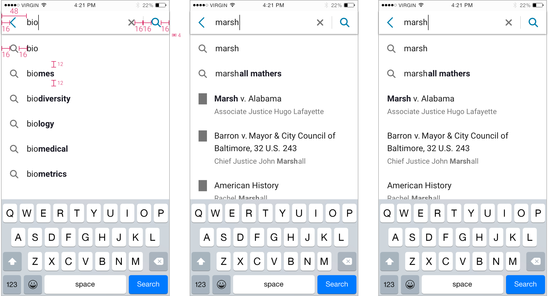
Mobile
- focusing in search field puts user in full screen mode (for search with submit only)
- incremental search does not go into full screen mode
Mobile Typeahead
Switches
General Specs
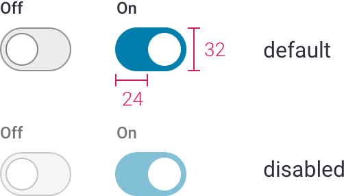
- circle to left means off, circle to right means on
- toggle must be paired with descriptive text that makes it clear what’s being toggled
- switches are 32px tall
- circles in switches are 24x24px
- circle is white
Switches
Off
- background is cloud-3
- border is 43% black
On
- background is shade #6
- no border
Disabled
- opacity: .5
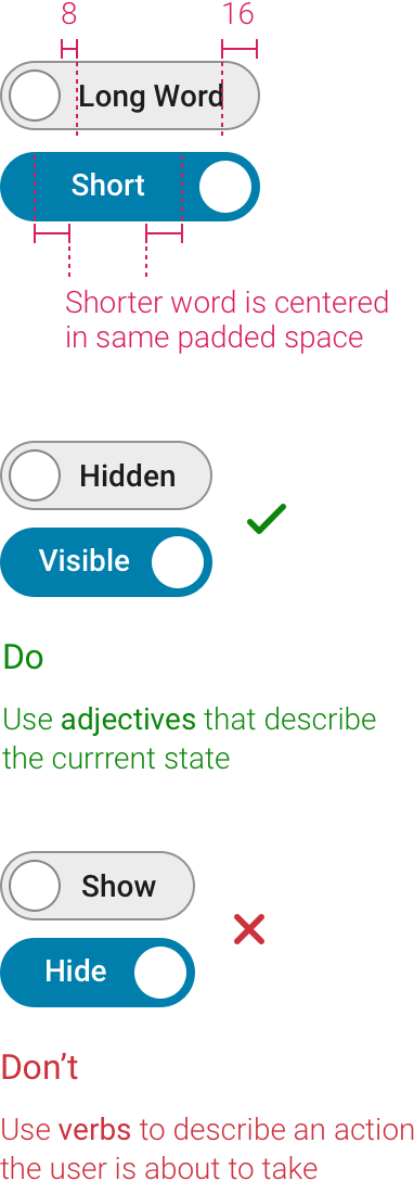
Switches with Text
- word should be an adjective that describes the current state
- text is Roboto Medium 14px, cloud-10 and white
Tabs
General
- Roboto Medium 15px
- cursor pointer on hover
- underline is width of text
- underline is 3px tall
- underline and selected word are same color (primary or secondary)
- suggested spacing is 40px between tabs
- underline slides to selected tab and blue text fades in in .2 seconds - transition-timing-function: cubic-bezier(0.7, 0, 0.7, 1);

Tables
Basic Styles
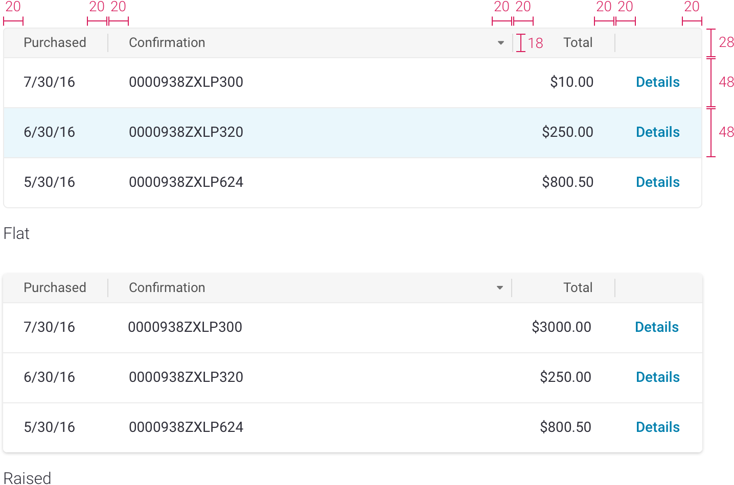
- headers are Roboto Regular 13px cloud-9, line height 1.23
- headers are centered vertically
- sort arrows are cloud-7
- header background is cloud-3
- body text is Roboto Regular 14px cloud-10, line height 1.36
- body text is top aligned
- dividing lines are 1px solid cloud-3
- rows can have hover states (primary or secondary #1)
- can be flat or raised depending on context
Rules
- left align text in body, right align numbers in body
- header alignment matches rest of column
- besides text, tables can hold links, buttons, and icons
- there can be no header for a column (ex: columns with action buttons)
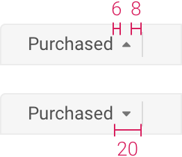
Sorting
- one column is sorted by default
- only one column sorted at a time
- arrow is always visible on sorted column header
- arrow is right aligned
- 6px minimun distance between header text and arrow
- up arrow is ascending order (a-z, low to high, old to new)
- on first click, column is sorted in ascending order
- down arrow is descending order (z-a, high to low, new to old)
- hovering over header of sortable columns changes cursor to pointer
Wrapping Text
- header text can wrap, but try to avoid it
- header text is centered vertically

Row Selection
- first column can be reserved for checkboxes to select an individual row

Toasts
General
- use other patterns (instead of toasts) wherever possible
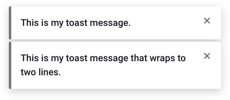
- keep messages short
- all toasts must have Xs
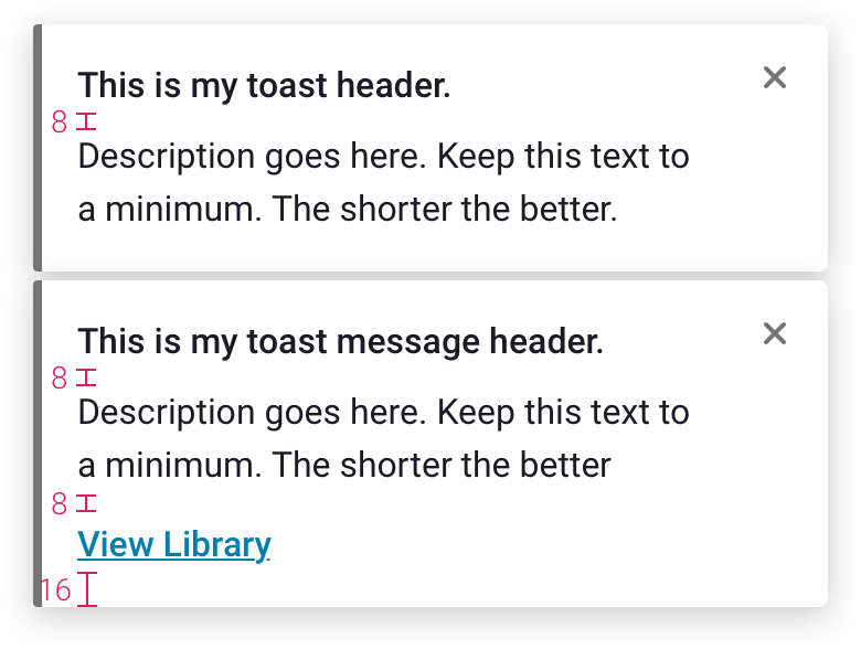
- all text is Roboto 16px, line-height: 1.5, cloud-10
- 4px rounded corners
- X is cloud-6
- X is contained in 48x48px clickable area
- box-shadow: 0 4px 15px 0 rgba(0, 0, 0, 0.2)

Basic Toast
- gray line is cloud-6
- message is Roboto Medium
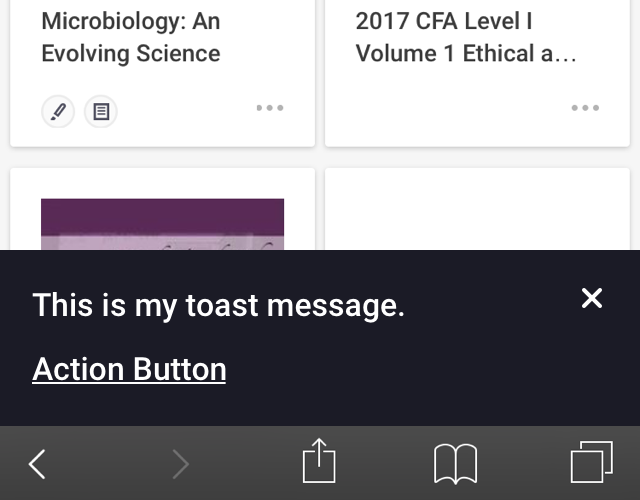
Basic Toast with Description/Button
- description is Roboto Regular
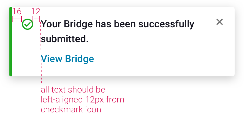
Success Toast
- notifies user that their action was successful
- use grass-1 for green line and checkmark icon
Error Toast
- notifies user that an error occurred
- use inline error messaging (instead of this toast) wherever possible
- use cherry-1 for red line and icon

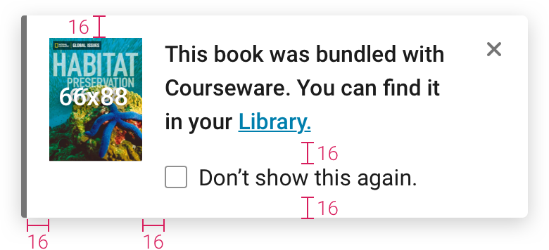
Toast with Image
- checking “Don’t show this again.” does not dismiss modal
- checkbox text is Roboto Regular
- image is top aligned within modal
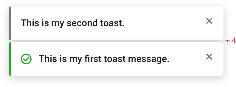
Toasts Stacked
- toasts stack on top right of screen
- stack slides up as toasts at top are dismissed
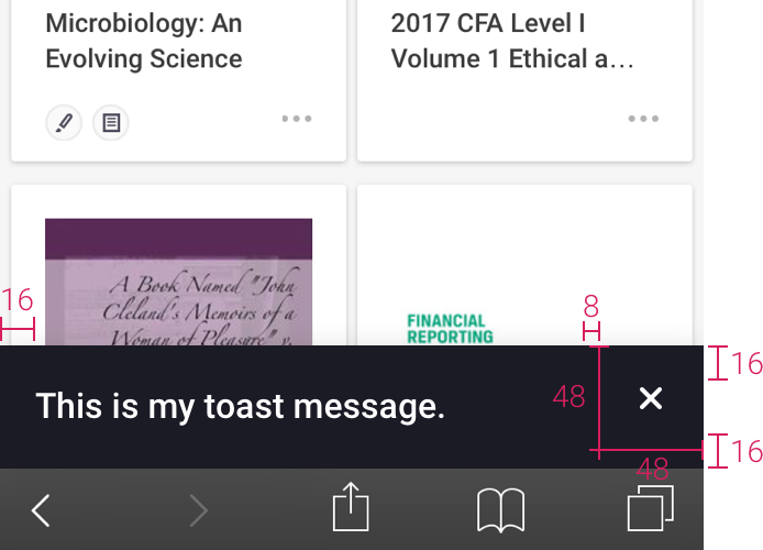
Mobile Toasts
- fits width of screen
- same shadow as on large screens
- background is ninja-11
- text on dark background is white
- toast slides up from bottom

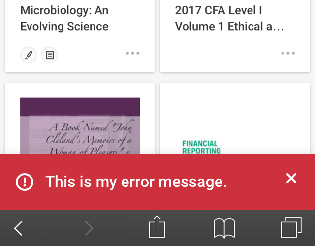
Error and Success Mobile Toasts
- icon is centered vertically with first line of message
- backgrounds are cherry-2 and grass-2

Mobile Toasts with Image

Tooltips
General Specs
- drop shadow: 0, 2, 8, 20% black
- background is ninja-10, white, or a color that complements the product color scheme
- white text on dark colors, cloud-10 text on light colors
- font weight 400
- keep text short
- fades in and slides up 2px in .15 seconds - transition-timing-function: cubic-bezier(0.7, 0, 0.7, 1);
Alignment
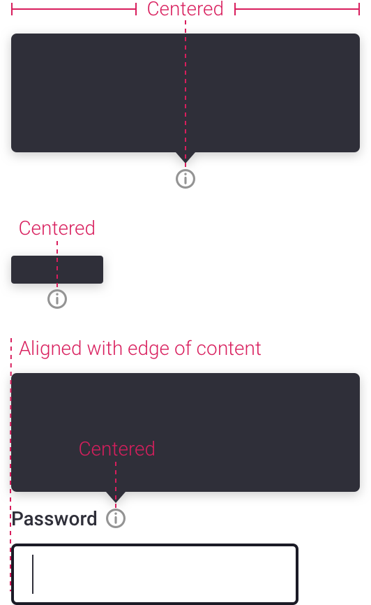
- center tooltip/helpbox above icon wherever possible
- caret can be off center in cases where you want to align the edge of the helpbox with other content on the page, or where a centered tooltip doesn’t fit in browser window
Basic Tooltips
Purpose
- displays text to identify an icon/button
Rules
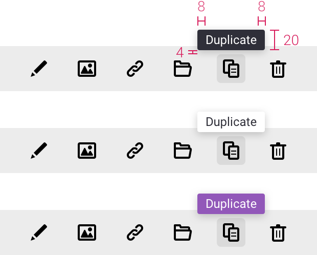
- appears on hover
- replaces browser default
- centered above icon unless otherwise specified, or unless there is no room in the window to place the tooltip above the icon
Specs
- 2px rounded corners
- Regular 12px
- appears on hover after .5s delay
- same specs when you mouse out of target area, except fade out is immediate
- see General Specs above for more info
Helpbox
Purpose
- displays more info than a basic tooltip, but less info than a dialog
Rules
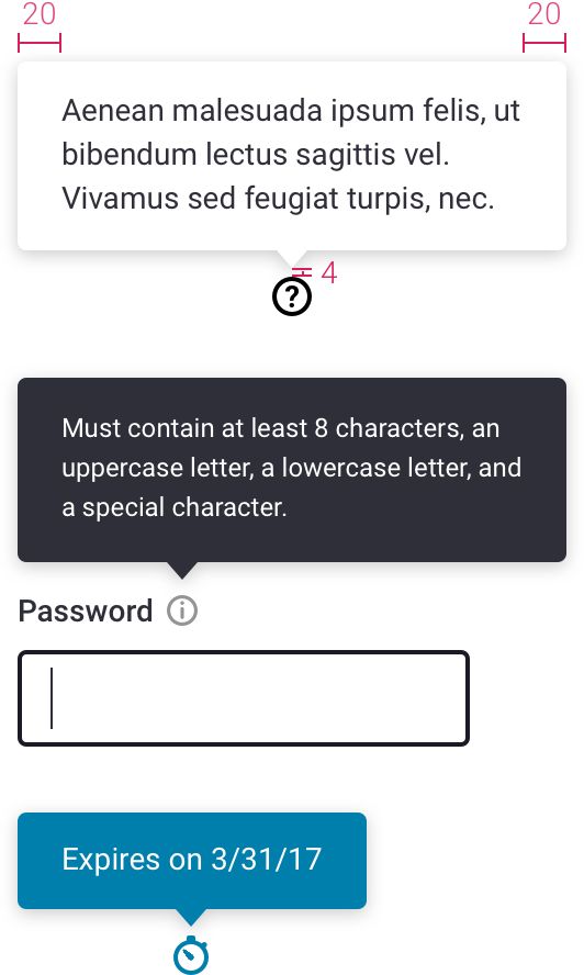
- appears on click
- disappears on click anywhere outside of helpbox
- caret and box centered above icon unless otherwise specified
Specs
- 4px rounded corners
- choose a text size that fits with your content, but make sure to use a consistent size across the product
- 12px, line-height 1.5
- 14px, line-height 1.43
- see General Specs above for more info
Errors
Specs
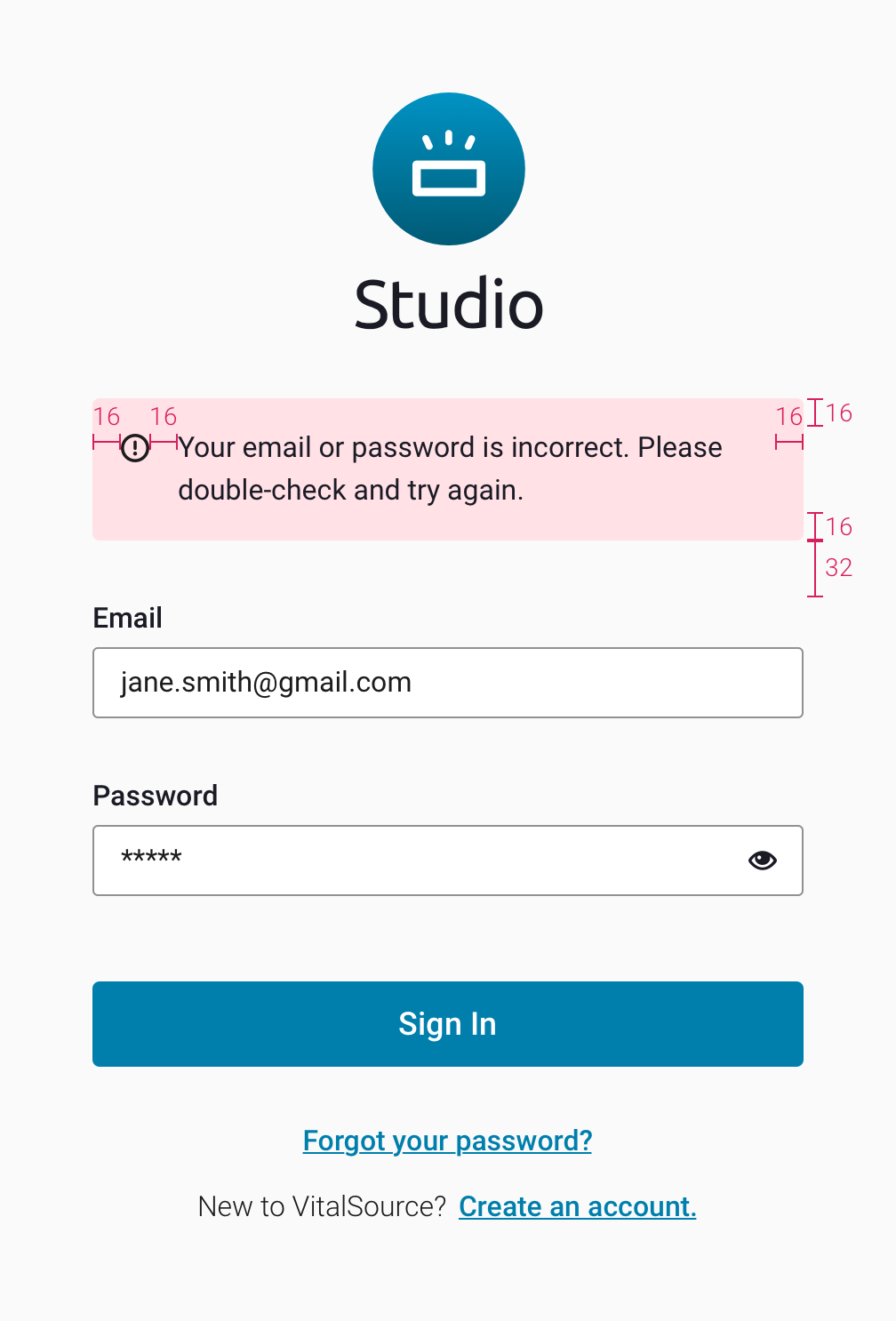
- keep them short and to the point
- sentence case
- no punctuation unless error is more than one sentence long
Commonly Used Errors
Generic
- "Required field"
Sign In
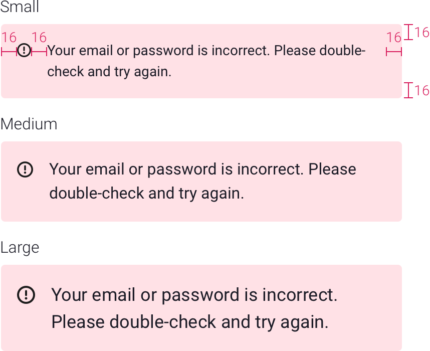
- "Email or password is incorrect"
Account Creation
- "Email is already in use"
- "Email is not formatted properly"
- "Password doesn’t meet requirements"
- "You must agree to continue"
Global Errors
- Use only when inline errors aren't applicable
Sizes
- small, medium or large
- medium is the default
Languages
Language Menu
- currently used in Bookshelf
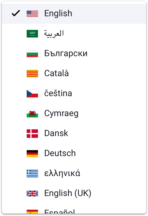
List of languages
Flag |
Name Displayed |
Location |
Language |
|---|---|---|---|
 |
English | United States | English |
 |
العربية | Saudi Arabia | Arabic |
 |
Български | Bulgaria | Bulgarian |
 |
Català | Catalonia | Catalan |
 |
čeština | Czech Republic | Czech |
 |
Cymraeg | Wales | Welsh |
 |
Dansk | Denmark | Danish |
 |
Deutsch | Germany | German |
 |
ελληνικά | Greece | Greek |
 |
English (UK) | United Kingdom | English |
 |
Español | Spain | Spanish |
 |
Español - México | Mexico | Spanish |
 |
Suomi | Finland | Finnish |
 |
Tagalog | Philippines | Tagalog |
 |
Français - Canada | Canada | French |
 |
Gaeilge | Ireland | Gaelic |
 |
עברית | Israel | Hebrew |
 |
हिंदी | India | Hindi |
 |
Íslenska | Iceland | Icelandic |
 |
Ítaliano | Italy | Italian |
 |
日本語 | Japan | Japanese |
 |
한국어 | South Korea | Korean |
 |
Nederlands | Netherlands | Dutch |
 |
Norsk | Norway | Norwegian |
 |
Polski | Poland | Polish |
 |
Português do Brasil | Brazil | Portuguese |
 |
Português | Portugal | Portuguese |
 |
Română | Romania | Romanian |
 |
Pусский | Russia | Russian |
 |
Svensk | Sweden | Swedish |
 |
ภาษาไทย | Thailand | Thai |
 |
Türk | Turkey | Turkish |
 |
Tiếng Việt | Vietnam | Vietnamese |
 |
中文简体 | China | Vietnamese |
 |
繁體中文 | Taiwan | Traditional Chinese |
Loaders
Colors can be updated to reflect product colors.


 PDF
PDF

 Passes AA with no restrictions.
 Passes AA at 18pt or larger, or 14t bold or larger.