Gamification Design for a New Study Tool

End-to-End Design Responsive
January 14, 2020

Gamification Design for a New Study Tool

Acrobatiq by VitalSource is a platform that provides tools for instructors to create adaptive courseware, using machine learning, to personalize learning experiences for students. In affiliation with Oxford University Press, Acrobatiq wants to design a fun, innovative way for students to study.

Task

I was part of an ambitious project to design a new study tool based on gamification and e-learning pedagogy.

  • Artifacts

    Research Reports, Wireflows, Prototypes, Code

  • Research

    Remote Usability Testing, Quantitative Survey, Remote Qualitative Interviews

  • Tools

    Sketch, Marvel, Whimsical, Miro, Survey Monkey

  • Team

    UX Designer (me), Cognitive Psychologist, Senior UI Designer, Junior UX Researcher, Product Owner, Engineer Manager, Developers

  • Timeline

    6 months

To comply with my non-disclosure agreement, I have omitted and obfuscated confidential information in this case study. All information in this case study is my own and does not necessarily reflect the views of Acrobatiq by VitalSource or Oxford University Press.

Kickoff with the Client

The Challenge

We are working with Oxford University Press to design a new gamified study guide tool as a companion for their eTextbooks. We are working with a Cognitive Psychologist, Pepper Williams, who designed the pedagogy and scoring system for the study guide. The challenge was to design an accessible, gamified study tool that stayed true to the original predefined pedagogy.

From OUP's perspective we have a very short timeline to design and develop the study guide. The application has to be ready for QA in four months and deployed for the fall semester with pilot courses. This will allow us to interview instructors and survey students for another round of development for Spring semester.

Figure 1.0 Case study overview.

Early Ideas

Pedagogy

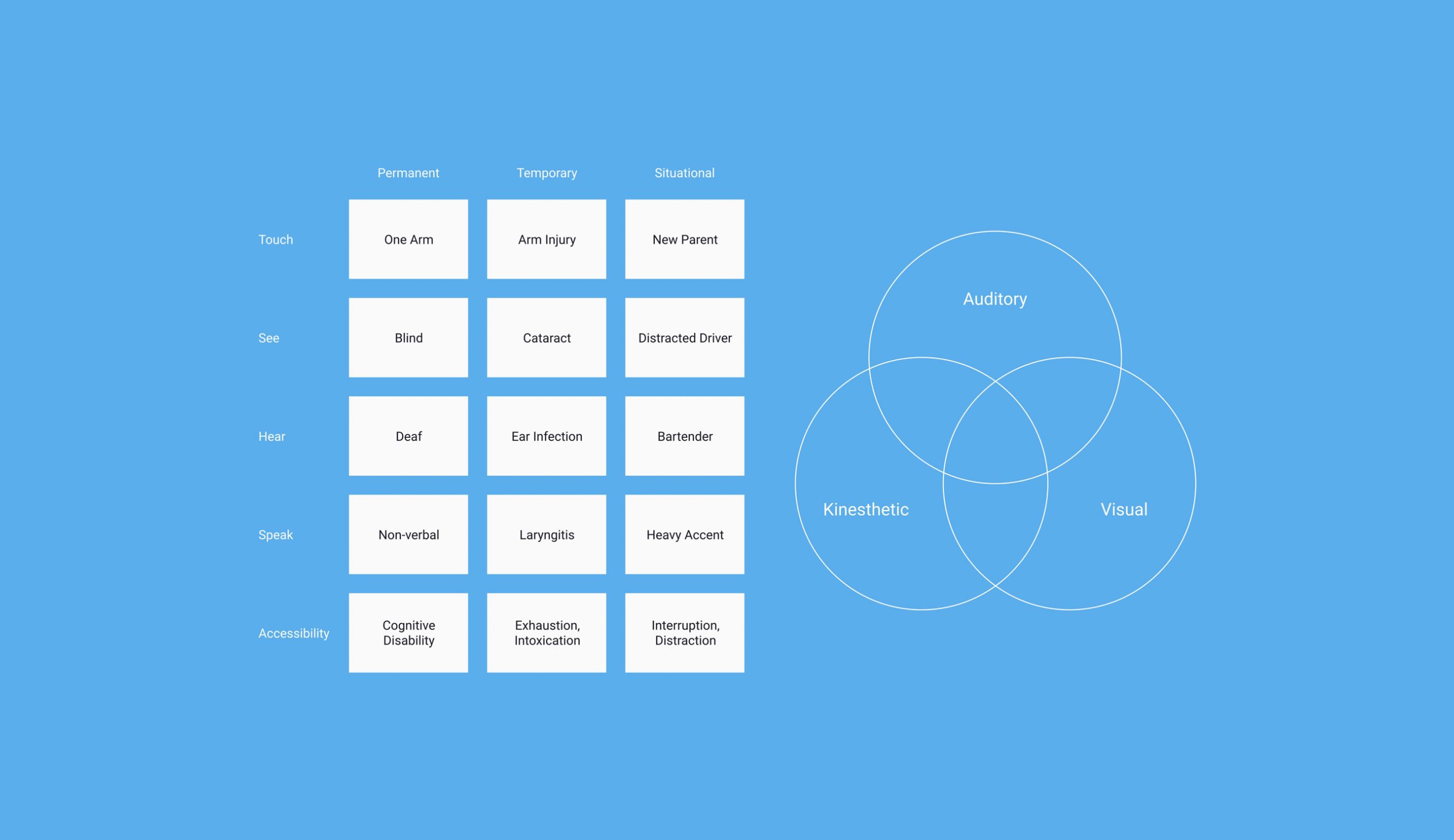
The challenge was to introduce elements of accessible gamification that enhance, and not detract from, the studying experience. Students would work their way through the study guide answering questions to receive variable stars for the number of attempts they have made at a question. Questions will vary in format and difficult. Students will finish the study guide once they reach a target star amount. Pepper developed a study guide with four different sections and each section had a unique studying experience.

  • Part 1 - Hangman Cloze questions
  • Part 2 - Multiple Choice with follow-up Cloze questions
  • Part 3 - Short answers with sample responses
  • Part 4 - Adaptive Close questions based on student performance in earlier sections
Figure 1.1 Diagram of student cognitive limitations and learning styles.

Striking a Balance with Gamification

Accessibility

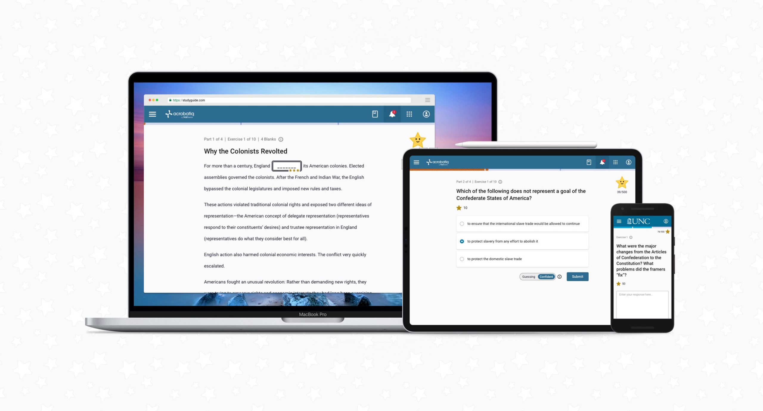
We really wanted to meet the gamification features which make this study tool a differentiator in the market. But we can't sacrifice the usability and accessibility of the application. The study tool is responsive across different devices, which means we have to design around different touch points. Students can be utilizing a mouse, keyboard, or fingers to interact with the application.

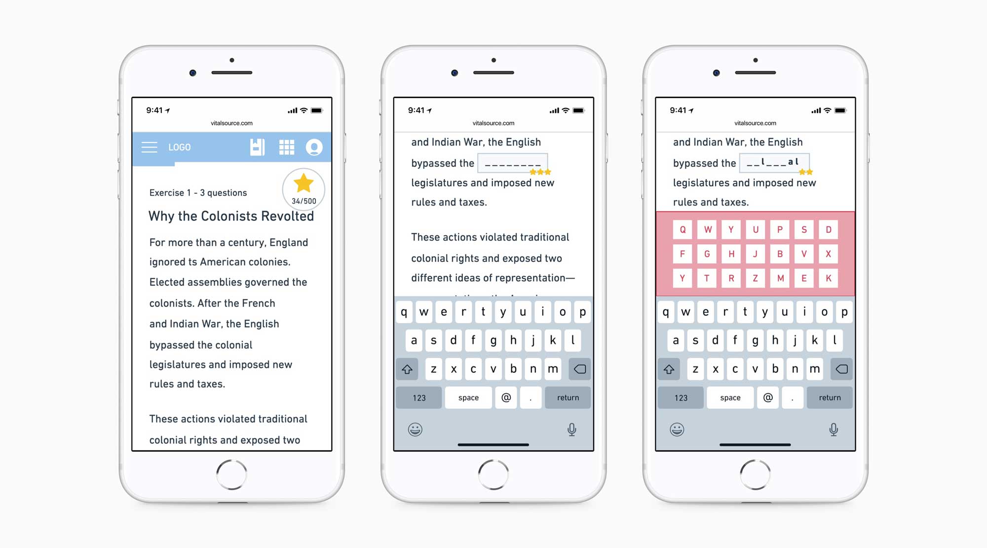
One of the most difficult experiences to design for accessibility is the Hangman Cloze questions. Pepper's original idea was that we would show a selection of possible letter choices in a pop-over for the Hangman experience. Early day prototypes of the Hangman pop-over proved to be inaccessible for mobile devices and screen readers.

Figure 1.2 Wireflows for desktop and mobile experiences.

Co-designing the Study Experience

Wireflows

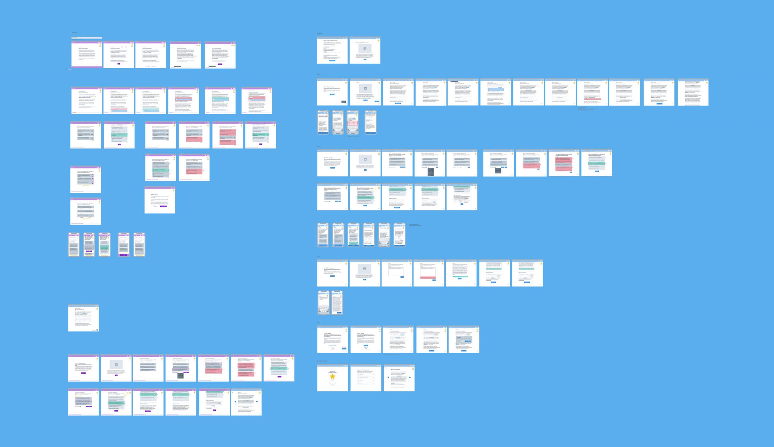
I worked with Senior UI designer Stephanie Schafer to wireframe the responsive wireflows of the study guide using the Whimsical application. There are key parts of the application that are considered for each question format:

  • Stars earned
  • Question feedback
  • Adaptive experience

We had prior experience with designing multiple choice and essay questions, so we were able to layout Parts 2 and 3 using what we had previously defined in the Studio project. Our efforts were focused on optimizing the gamification and accessibility for Hangman questions in Part 1 and 4.

Figure 1.3 Low fidelity wireframes for tablet.

Designing Hangman in a Different Way

User Interaction

Input

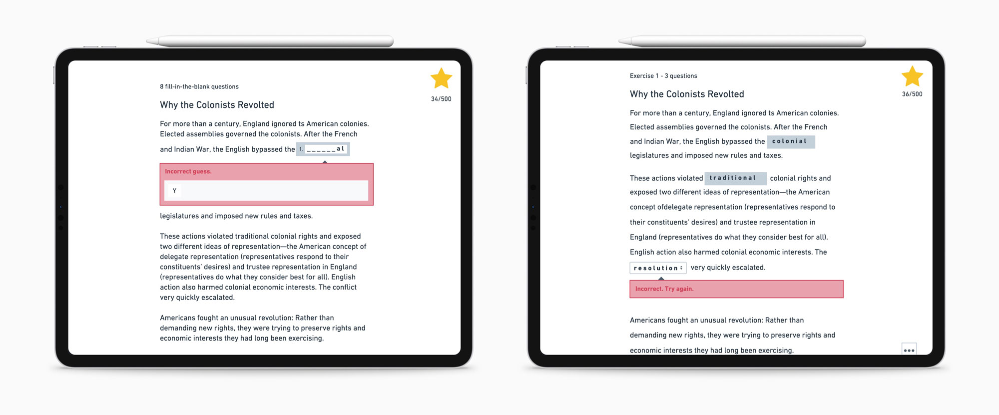
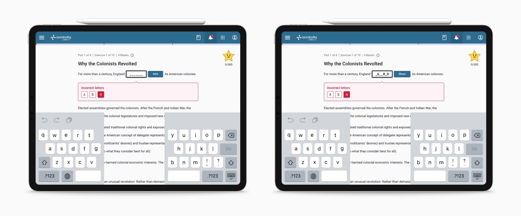
At the beginning of each study guide, we explain to the students how to answer these questions and give them an example question. Students can input letters A - Z using their keyboard along with certain special characters. We want to limit the amount of tries when answering these type of questions in order to reduce fatigue. As a result, we have to allow for hints and skips if students feel they have exhausted their chances.

Feedback

Each time a student enters an incorrect letter, their star potential is decreased and an incorrect letter bank is visible. There also must be feedback for when students get something correct and when they earn stars for completing the question.

Figure 1.4 Mobile wireframes for Hangman question experience.

Designing the Algorithm Behind Hints

Learning Mechanics

Hint generation is optimal when the user has not guessed any letters, but we want to optimize the way hints work when users have attempted the question with a couple letters.

  • How might we maximize the guesses left for the user
  • How might we avoid revealing too much of the answer

We wanted to only reveal the ceiling of 1/3 of the blanks left if the user had more than 2 blanks remaining in the question. Displaying the highest possible bucket of unique letters allows for a higher number of guesses left over, thus making it more challenging for the student.

Figure 1.5 Initial algorithm design for hints.
Figure 1.6 High fidelity mock of the feedback and hint experience on Hangman questions.

A Star was Born

Microanimations

I worked on how we can leverage animations to add some delight and enhance the aspect of gamification. In my research, I looked at how games leverage animation to not only add delight, but also provide feedback to the user. I worked in After Effects and programmed the micro-animations around how stars were loss and earned. This eventually led to the development of the application's anthropomorphic character Starry. Starry will respond, with emotions, to how a student answers their questions.

Figure 1.7 Starry emotions.

Using the Design System and React Kit

Final Prototype

We leveraged our existing React Library and Sketch UI Library so that we could quickly build our application UI within the given short timeline. We stuck with native components when possible, but had to customize the textfield component for the Hangman question due to the gamification features. This allowed more time for us to complete the Usability Test, Quality Assurance, and Accessibility Audit before shipping the product to the client. In our final development phase, we worked with the Paciello Group to meet accessibility guidelines for the code audit.

Analyzing the Prototype

Usability Testing

We went back into the field to test our MVP prototype with students from various institutions. We wanted to make sure we were building a tool that improved student learning. We identified the following usability objectives:

  • Measure user's comprehension of the new cloze, multiple choice, follow-up, and essay question types.
  • Measure user's comprehension of the scoring system and target score.
  • Gather information on user's expectations for a study guide and whether this app meets their needs.

Finding the Right Students

Screening Participants

Junior UX researcher David Soto-Karlin helped with the recruitment of students. The recruitment for this usability test took some time because we started this project before the COVID-19 pandemic reached America. We were now dealing with students moving out of dorms and back into their homes, therefore, some sensitivity was required around recruitment of testers. We screen participants for the following criteria using Survey Monkey:

  • Range of study habits from unorganized to regimented studying.
  • Use of tools/technology from none or very little to habitual.
  • Range of education from freshman to senior.
  • Students have recently (within the last semester) taken an American History course**.
  • Students are currently attending or recently attended a classroom using digital resources.

**The content we authored for the prototype was from a chapter in an American History textbook and it was important that the student had background knowledge to gather clear data.

Defining the Use Cases to Test

Usability Script

I created a usability script that asked students to complete four different use cases. Each use case had follow-up questions around individual parts of the study guide. The sessions were one hour long and I had team members also attend the testing as data loggers or observers. Participants were then asked to complete a post-session questionnaire to measure their attitude toward the study guide.

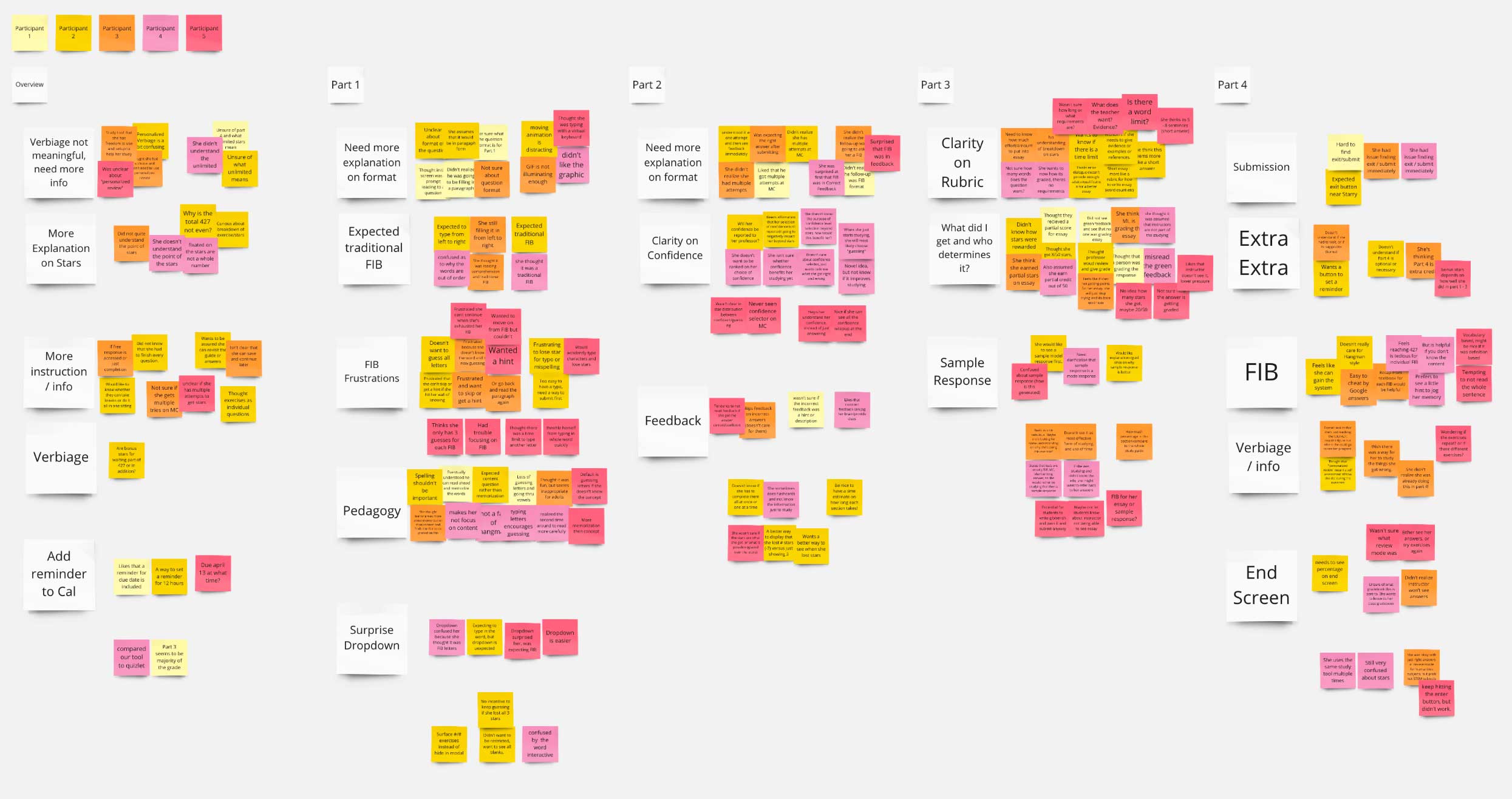
Figure 1.8 Affinity map of the data collected from usability testing using the collaboration app Miro.

Synthesizing the Data

Affinity Mapping

I've omitted the full report here and only detailed the top three concerns from the synthesis.

More Clarity Around Question Requirements

Students wanted more written information around what to expect when answering the questions. For example, the short answer questions needed a character limit so students know how much to type into the text area.

We decided to add small amounts of information in the UI, but also bundle an introduction section in the beginning of the digital textbook for student reference. This explains what is expected from students in each part of the study guide.

Recall of Hangman Experience Did Not Meet Needs

We were optimistic in our intention of gamifying the recall learning strategy for our cloze questions; however, testing revealed that students did not find the gamification helpful. They thought it prioritize spelling over recalling content and encourages random guessing.

We decided to iterate on this question type to include more selects, where spelling is not a requirement to select a correct answer.

Students Wanted More Features

Students were asking for a more robust post-completion experience. They asked for a roll-up of all their scores and a more robust review experience where they can see their answer choices. Overall, these requests were focused around the idea that students wanted to review learning objectives they missed the first time around.

We want to provide opportunities for students to further learning beyond the application, so this feature will be on the roadmap for the next version of study guide.

Figure 1.9 Responsive mocks on laptop, tablet, and android.

Post Analysis of the Application

Pilot Feedback

Quantitative Survey

We continue to collect data through a post launch survey deep-linked through each study guide session. Students can self-select to provide feedback for a chance to win a gift certificate. As the semester progresses, we can quantify student attitudes toward sections of the study guide.

Instructor Interviews

Finally, we are waiting until the end of the semester to interview instructors in 30 minute sessions. Interviews are currently being scripted and a list of participating instructors will be provided by Oxford University Press. We are hoping to gather more feedback from the instructor on the following key points:

  • How was integration of the study guide?
  • What changed compared to the previous semester without the guide?
  • What impact did this have on grades?
  • What were the pain points?