Redesigning an Authoring Tool for Publishers

Responsive UI UX
September 20, 2016

Redesigning an Authoring Tool for Publishers

VitalSource Studio is a wysiwyg editor that allows subject matter experts to author eTextbooks for education. Studio provides interactive content and formative assessments that has been proven to enhance the student reading and learning experience.

Task

I redesigned the web application to meet publisher needs and improve the digital learning experience for students.

  • Artifacts

    Wireframes, Prototypes, Research Reports, Accessibility Reports

  • Research

    Secondary Research, Competitive Analysis, Usability Testing

  • Tools

    Sketch, Marvel, Axure, Miro, Overflow

  • Team

    UX Designer (me), Senior UI Designer, Product Owner, Product Manager, QA Engineer, Developers

  • Timeline

    2016 - 2019

To comply with my non-disclosure agreement, I have omitted and obfuscated confidential information in this case study. All information in this case study is my own and does not necessarily reflect the views of VitalSource Studio.

Recovering from Bad Architecture

The Challenge

I was assigned to Studio to redesign the publisher authoring experience from end-to-end and add new learning features to the student experience. The project was ongoing work over the span of three years.

Studio was built on an old architecture that had many limitations around how we can design features. We were trying to build new innovative features on top of existing legacy features. The challenge was to have them be compatible and accessible.

Prior to my arrival on Studio, there was no design process for research or user testing and design decisions were not data driven. Design decisions were made based on leadership and business goals rather than publisher and student interviews and testing. The ROI on Studio was negative, as VitalSource sunk more money into the product than it was outputting. We needed to turn the product around and increase customer onboarding.

Figure 1.0 Case study overview.

Surveying the Landscape

Research

The project was immense and covered the authoring side, which spanned media management, content editing and management, and concurrency, to the deployment and building of the content for student view. My initial work on the project involved revisiting the architecture and working on a competitive analysis to familiarize myself with the product landscape and see where we can make improvements.

Figure 1.1 Detailing the information architecture of the entire application.

Competitive Analysis

I identified nine relevant competitors that were in the same landscape as Studio. I took at each product's user experience in terms of workflow, content management, and customization. I rated each product's satisfaction amongst five key points:

  • Overall usability
  • Workflow (ease of collaboration and concurrency)
  • Media Management (uploading and editing media)
  • Level of Customization (color, typeface, etc)
  • Content Management (ease of use and diversity of blocks)
Figure 1.2 Spider charts for detailing satisfaction amongst key features. Actual data points removed due to NDA.

Optimizing the Roadmap

Goals

We wanted to make Studio easier to use and meet the needs of our customer base. In order to do this, we need to look at why products like Articulate and Inkling Habitat scored better in overall usability.

Based on our prior research, we have identified key features in Studio that need to be revisited or added in order to increase customer satisfaction.

  1. Improve use cases of importing and managing book content.
  2. Flexibility in content authoring with more interactive blocks.
  3. Improve the application's accessibility rating.

Figure 1.3 Wireflows for the entire Studio Experience using Overflow app.

Starting Over

The Library

Due to our tech debt, the team decided to scrap the entire front-end and start over with React. This will allow us to leverage our design system react library and have a consistent UI. We are also focusing our efforts on reimagining the library view, the initial interaction customers will have with Studio, before delving deeper into other Studio features.

Publishers were having major pain points just trying to find their eTextbook. The focus should be getting them into the book in order to start editing rather spending time finding and navigating to the book. My usability audit revealed that simple tasks were very difficult to find.

  • Too many clicks to get to publisher's eTextbook
  • Publisher can't find actions to edit book metadata
  • No feedback on any actions taken by publisher
Before After

Figure 1.4 Before and after library view.

Reducing Authoring Friction

Finding Books

Publishers land immediately on the library view and can now easily scan their book covers to find a book. We've revealed contextual information and removed all the noise that was created by unnecessary information from the original table. We've added a filtering system that allows publishers to reorganize their library based on more contextual sorts, like recently edited, rather than just a generic sort.

Finding Actions

Actions are attached to each book and no longer require a hover to reveal them. The option to rename a book was on a secondary page, but is now grouped with the main page actions.

Feedback Now

Before the redesign, publisher's would upload a book and get no feedback. Every action now has feedback that communicates to the publisher about success, failures, and blocks.

Figure 1.5 Studio Library Sample.

Designing for Legacy

Personas

By talking to publishers, we've identified three different use cases to meet publisher needs. Not all publishers can afford resources to author everything from scratch, so we provided a method for publishers to import existing book formats into our accessible EPUB standard. A third alternative allows publishers, with little effort, to modify their PDFs and add a layer of interactivity without changing the format.

  • Starting from a new Studio EPUB
  • Importing an XML, PDF, or EPUB
  • Add interactivity to an existing PDF
Figure 1.6 Adding or importing content and empty state page for a project with no content.

Designing for Accessible Interactivity

Content Authoring

Studio's WYSIWYG editor includes a standard variety of drag and droppable static content like Headers, Body Text, Quotes, etc. However, authors want a way to add assessments and interactive content into their EPUB. After all, the selling point of utilizing an EPUB over a traditional textbook is the dynamic reading experience. My work on Studio involved adding over twenty new interactive features.

Figure 1.7 Examples of the various interactive features I worked on for Studio.

Sequencing Question Accessibility

Screen Reader Users

The sequencing question feature reflects our efforts in innovation and maintaining accessibility. Sequencing questions ask a student to reorganize a list of options either chronologically or relatively based on some context. This feature is the biggest challenge for accessibility because the motor and cognitives loads are higher compared to sighted mouse users.

Instructions are read aloud to the screen reader before attempting the question.

<span id="operation" class="assistive-text">
  Press Spacebar to select an item in the list and reorder it.
</span>
<ol role="listbox">
  <li role="option" draggable="true" aria-describedby="operation" 
      tabindex="0">
    Battle of Midway
  </li>
  <li role="option" draggable="true" aria-describedby="operation" 
      tabindex="-1">
    Japan Surrenders
  </li>
  <li role="option" draggable="true" aria-describedby="operation" 
      tabindex="-1">
    Pearl Harbor bombed
  </li>
  <li role="option" draggable="true" aria-describedby="operation" 
      tabindex="-1">
    Japan Surrenders
  </li>
</ol>

When a user selects an item from the list an update is sent to the screen reader.

updateLiveText("Battle of Midway, grabbed. Current position in list: 1 of 6. Press up and down arrow keys to change position, Spacebar to drop, Escape key to cancel.")
Figure 1.8 Sequencing question design for desktop, tablet, and mobile.

Feedback from Sighted Users

Usability Testing

I built a prototype using Axure for both desktop and mobile to be tested at a local university. In order to diversify the data and verify the test, I tested the prototype with some internal colleagues (removed from the project) before I went into the field. The results were overwhelming positive with minor improvements we could make to the UI. The links below are the final changes with the feedback from students.

Key Results

  • Users needed more affordance that elements are draggable. We added hover and focus changes to the elements and allowed users to invoke the drag option from the entire row.
  • Users had the most trouble on mobile because the drag and droppable elements interfered with their ability to scroll the page.
  • The ability to drag and drop becomes more difficult if the contents overflows the screen. Authors should be warned not to have too much text or big images as options.

Putting It All Together

Since release of the updated experience we have increased the number of onboard customers and books published directly to Bookshelf. New on-boarded companies include institutions and corporate sectors from the USA and abroad. The experience resonated really well with publishers and Studio has received great feedback from customers.

0
percent increase in customers
0
percent increase in total sessions
0
percent increase in published content

Final Thoughts

Retrospective

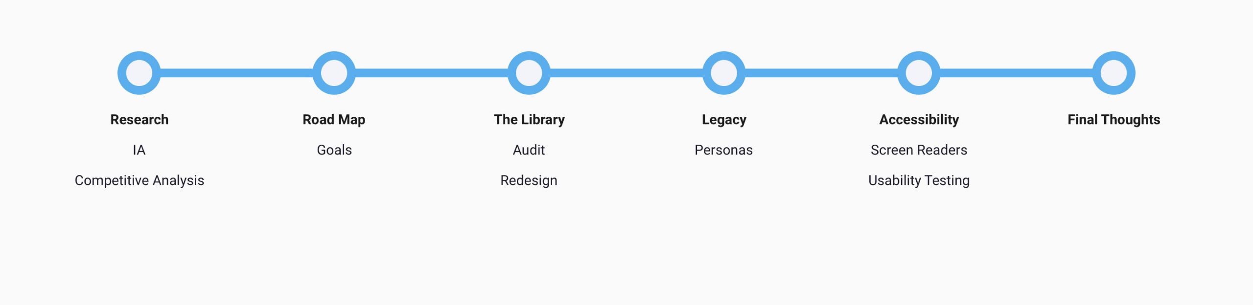
User Research and Testing

Rome wasn't built in a day. The team did not have a process for research and testing and our initial success in usability testing proved to leadership that this was worth the effort. Moving forward, leadership seems more involved and excited about research and testing. We have a long road ahead to fully integrate research and testing into our process.

Accessibility Testing is Essential

User testing can be difficult for even the top companies with a solid user research foundation. Accessibility testing requires knowledge of how screen readers and other mouse alternatives work in various environments. This type of field work requires foundations in WCAG and accessibility, user research, and technology. One easy way to bring this type of testing is to include a third party accessibility consulting firm. However, for long term effectiveness, our team should look at accessibility courses and investment in screen reader devices in the office. Recruitment for students with screen reader needs is probably a tough screening process, but worth the effort if we want to have a full in-house testing process.

Small Team, Big Scope, Sunk Costs

We had a very small team of developers for such a big project. Initially we were building on top of the original architecture because we feared we have invested too much into this project. While the first step was small in replacing the front-end with react, this shows that we were nimble enough and benefited more from starting over. There is a still a lot of work to do in replacing the back-end and other parts of the application. There was always a lot of asks from publishers and leadership to add new features rather than refactoring old features. We were constantly kicking the can forward to stay afloat. We would have benefited from having a smaller scope and working on making the original experience more user friendly.